Why one creative rarely works for both platforms
Meta and TikTok both show ads inside a feed of content people scroll through quickly, which makes it easy to assume the same creative logic applies to both. It mostly doesn't. Meta's feed mixes ads with photos, links, and posts from people you know, so an ad that looks intentionally produced doesn't feel out of place. TikTok's feed is almost entirely short-form video that feels shot in the moment, so an ad with the polish of a traditional commercial reads as an obvious interruption. The fix isn't to make worse creative for TikTok — it's to make creative that matches the native texture of each platform's feed.
What Meta creative needs
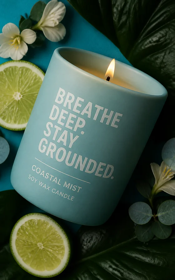
Meta creative has more room to build. Viewers scrolling a feed are more tolerant of a beat or two of setup before the point of the ad lands, especially in placements like feed and in-stream, where the surrounding content is also more static. This is where a slightly more polished, composed shot — good lighting, clear product framing, a deliberate composition — tends to perform well, because it matches the general visual register of the rest of the feed. On-image text works reliably here too: a clear headline or offer callout sitting over a clean part of the image, positioned to avoid the caption and engagement icons along the edges.
What TikTok creative needs
TikTok creative has almost no room to build. The hook has to be in the opening frame — motion, an unexpected visual, a direct address to the camera — or the viewer is already gone before the product is even shown. Vertical, full-bleed compositions that feel like they were shot on a phone tend to outperform polished, centered product shots, even when the product itself is identical. On-screen text still helps, but it needs to sit clear of TikTok's UI, which stacks along the right edge and bottom of the screen — captions, likes, and the caption text all live there, so keep key text centered or upper-frame instead.
Side-by-side comparison
Here's how the two platforms compare on the specifics that actually change how you should prompt and export your creative.
| Spec | Meta | TikTok |
|---|---|---|
| Aspect ratio | 1:1 or 4:5 for feed, 9:16 for Stories and Reels | 9:16 for nearly every placement |
| Ideal opening | Can build for 1–2 seconds before the point lands | Hook needs to land in the first frame |
| Opening style | Composed, clearly-lit product or lifestyle shot | Motion or a direct-to-camera moment |
| On-screen text placement | Avoid caption and reaction icons along the edges | Avoid the right-edge icon stack and bottom caption bar |
| Pacing | Slightly slower, more deliberate composition | Fast, native-feeling, minimal setup |
| Visual texture | Polished, feed-appropriate photography style | Native, phone-shot, UGC-adjacent style |
| Best format | Composed product or lifestyle image | Vertical frame that looks like organic content |
Which platform to prioritize for your creative
If you can only prioritize one platform's creative, prioritize based on where your media budget and audience actually are, not on which format is easier to produce. Once you know the platform, the highest-leverage move is writing a platform-specific prompt from the start — vertical and native-feeling for TikTok, composed and clean for Meta — rather than generating one asset and reformatting it for the other. Tryatria supports both directions from the same product brief, so testing platform-specific variants costs a prompt, not a production cycle.